KOOL
Empower your freedom.
Country
United States of America
Time frame
2023
Industry
Web3, Blockchain
Project type
Website
Services
Web-Development
Technologies
React, Next.js 13, SCSS, MongoDB
Each & every case is special for our team. Our challenge with Kool was time. Our developers created this website within 2 days. We coded it in 48 hours, remaining high quality of the final product. Let’s see how we did it & which tech stack we used.
Steady? Go!
Kool is…
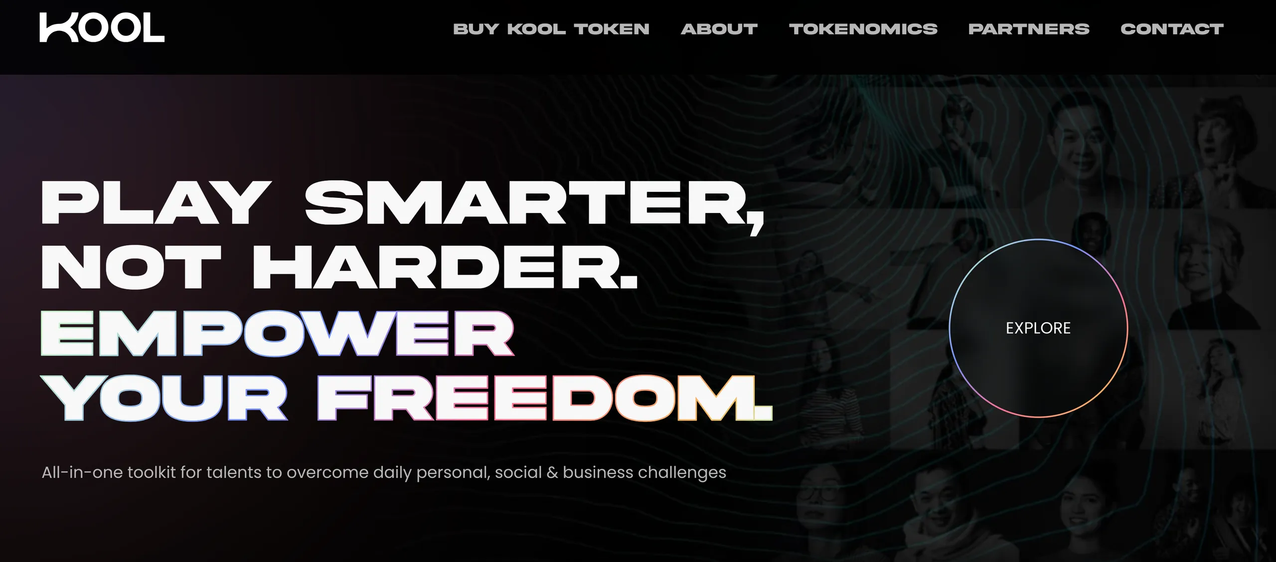
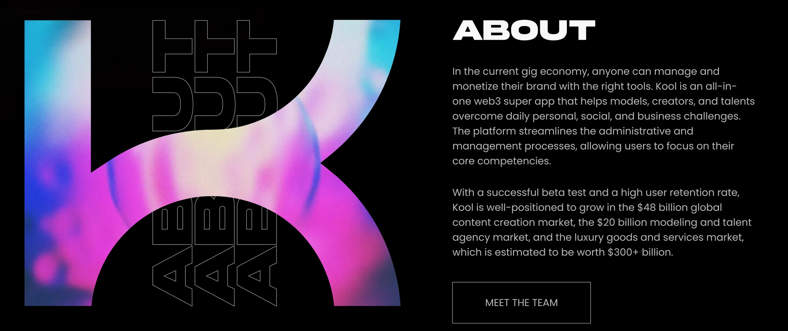
Our star of the fastest created websites. Kool is an all-in-one web3 super app that helps models, creators, and talents overcome daily personal, social, and business challenges. The platform streamlines the administrative and management processes, allowing users to focus on their core competencies.
KOOL team needed to create a business card site as quickly as possible, while maintaining a high level of quality, of course. Our partners contacted us, and we were ready to provide a complete landing page development cycle within two days.

Our Tech choice
Yeah, we might have mentioned it too many times. Still, this case of creation the website for Kool, also needed the highly optimized technologies to be used. Thus, we’ve chosen React, again. To explain you our choice, all we need is just to remind you the main pros of React itself. While React uses virtual document object model, all the changes happening run in React directly. Thus, the updates of the page structure occurred are very optimized. As the changes firstly happen in the virtual environment of the document object model and only after the numerous optimizations it transfers onto the page that the user sees.
With that we may conclude, that to changes the web we require a piece and not a ton of time. To optimize all the processes — was the core strategy within creation of the website for Kool in 48 hours.
We also used the Framer motion library, which helped us render animations on the client’s website. We should also mention that using Framer motion in combination with the React Lenis library allowed us to create smooth scrolling of pages with a soft display.
Talking a bit more about the slide show — we used the Swiper library to implement that. What's worth to be mentioned as well is that “Swiper is the most modern free and open source mobile touch slider with hardware accelerated transitions and amazing native behavior.”, : as they say on their own website.
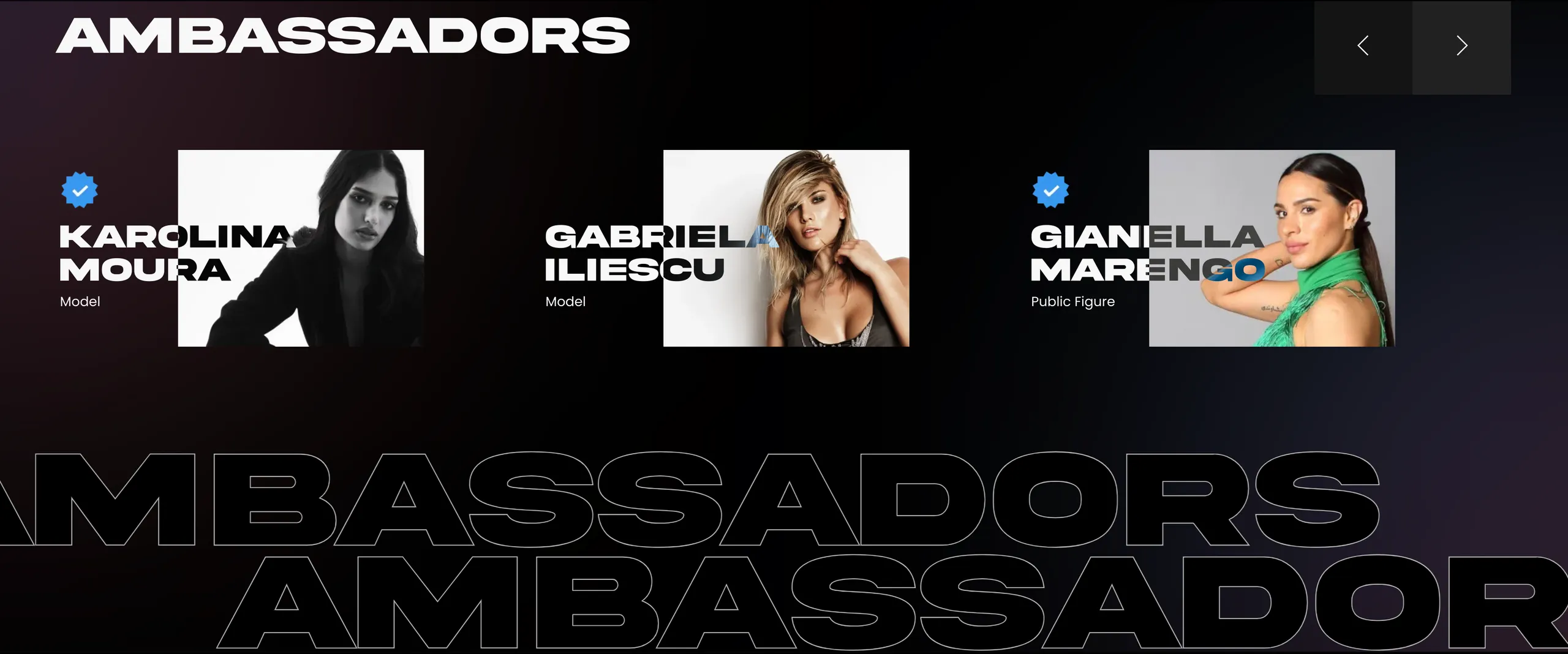
You’ve definitely noticed the peculiarities of the colors of the text in the ambassadors' photos. We used the color inversion option to implement that. We used the realization way of inversely in relation to the background. That is why the Native Browser API was chosen to implement this functionality.
Thanks to this choice, the website turned out to be functional and fast, leaving its primary UI ideas embodied.
How did we manage to create it in 2 days?
Our main principles during this project were Optimization and Teamwork. Nothing of these could’ve worked without the other one.
There is no secret formula or just a secret in here. All we had were our team knowledge, years of experience and strong desire to help our client and deliver the highest quality product. And, yeah, once again, we did it.

